The “color of the year” concept that Pantone started back in 2000 has been around for 17 years now. Since then, other companies have started to introduce their own picks for color of the year. There’s some debate on whether there is any 1 clear authority on the subject anymore (except for the fact that Pantone’s color of the year influences more than design itself). Either way, I like the healthy competition, innovation, & range of possiblities that the color of the year concept has introduced.
Each company’s 2017 color of the year seems to have a little something in common. Nature. They all seem to be somehow nature inspired.
THE GREENS
Colorhouse – Almost Ripe
This color is a super bright & cheery citrus-y color that’s really more yellow than green. Based on the description, almost ripe is inspired by Brazil’s banana production so the name & the color are fitting.
Added Bonus: Colorhouse paints are eco-friendly.
Valspar – Botanical yellow-green
This is a tricky color. I personally love it, but it’s not going to be for everyone. While it’s not “‘70s avocado” green, it’s not a true green either. Unless it really speaks to you, use it in small doses, where there’s less wall space, or in a streamlined design.
From the site: “this color is inspired by the zero waste movement and living sustainably.” What’s not to love?
Pantone – Greenery
Refreshing. Natural. Feels like it was pulled from the landscape right outside my front (or back) door.
I’m a little partial to Pantone’s pick because I believe every interior space – residential & commercial – should include some greenery in the form of live plants. They’re naturally uplifting & clean the air. That’s the feeling I get from this color – greenery makes it easy to “go green” with your decor.
BEHR – Jade Dragon
Behr is an old favorite. I’ve been using it for years and still have my old, super huge, extra heavy color fan deck. I’m on the fence about this color, though. It’s pretty, maybe even a little girly. Instead of being vibrant like the previous 3 greens or deep & rich like the next 2, it’s sitting somewhere in between. With all these really saturated colors, I’m just not sure if this 1 will stand up to the competition.
Pratt & Lambert – Leafy Bower
Luxurious, green jewel tone. Leafy Bower looks like it was pulled from a slice of green agate.
Farrow & Ball – Studio Green
Talk about deep. Studio Green is complex. You will think it’s black, it will look like it on a color chip (don’t use those) or on something small. But… Paint a door, cabinets, or wall this color & you will see the deepest of dark greens. Not a 1980’s forest green but a modern Victorian green – if there is such a thing.
THE BROWNS NEUTRALS
Sherwin-Williams – Poised Taupe
I was on the fence about this pick when it was first announced. I love Sherwin-Williams, but taupe? The more I looked at it, alone and with other colors, the more I liked it. It’s a cozy, traditional, earthy kind of color with a touch of grey. I think the grey gives it a little more dimension and when I saw it with the SW Naval that’s 1 of my “go to” colors, I couldn’t help but like it.
Chalk Paint® by Annie Sloan – Honfleur
I am not a big chalk paint fan. But I wanted to include this color because the point of these colors is how they channel the colors of nature. I know you’re probably saying… But. It’s. Brown.
It is. But remember that chalk paint looks different in the can than on something like a chair or accent table. And this color makes me think of the ground on hiking trails & those stones we step on (& collect) at the edge of the beach.
THE PURPLES
PPG Pittsburgh Paints – Violet Verbena & GLIDDEN – Byzantine Blue
These 2 are very similar – not surprising since they are from the same parent company. Both are a pretty bluish-purple (or purplish-blue) with grey tones. Reminds me of an early morning or late evening (past dusk but not quite dark) cloudy sky – calm & peaceful.
Dulux – Starry Sky
Another violet color of the year entry is Starry Sky. It’s name tells it’s story; similar to the 2 PPG colors, this one also reminds me of the night sky. From the site: {it} “is a mid-intensity, grey-violet colour. This purple is mysterious, exciting and calming all at once”.
Olympic – Cloudberry
The company considers this a calm & serene color that complements a minimalist style and invites homeowners to disconnect & unwind. Cloudberry is decidedly purple, but a soft muted version so it’s still very calming.
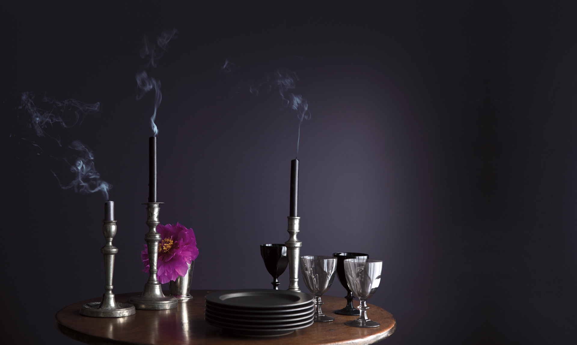
Benjamin Moore – Shadow
Mysterious. Seductive. Dark. Neutral. Royal. I LOVE this color. I repainted my bedroom last October in a similar but lighter color from SW. When Shadow was announced, I almost immediately wanted to paint it again. I didn’t but this color is EVERYthing… It would be great in a bedroom or powder bath.
Added bonus: Benjamin Moore paints are eco-friendly
Wrapping up
There seems to be a trend toward more natural colors – shades of green from bright to muted, sky inspired blues & purples. Even the colors that you wouldn’t immediately consider nature inspired actually take on colors of items you might find on beaches or in forests – natural rock, naturally occurring stone (think jewel-like quartz), even forest floors.
Even if you don’t see the natural beauty in any of these colors, do any of them “speak” to you? Would you use them in your home or office?


